CTRL+Z – Reverse your chronic illness
CTRL+Z (Control + Z) focuses on supporting and motivating people with a chronic condition to stick to a healthy lifestyle in order to improve or reverse their chronic illness. CTRL+Z is especially designed to track symptoms and improvements while on a healthy routine program, which includes plenty of sleep, sports activities, and meditation.
- UX Design
- User Research
- Ideation
- Wireframing
- Prototyping
- User Testing
- UI Design
- Logo Design

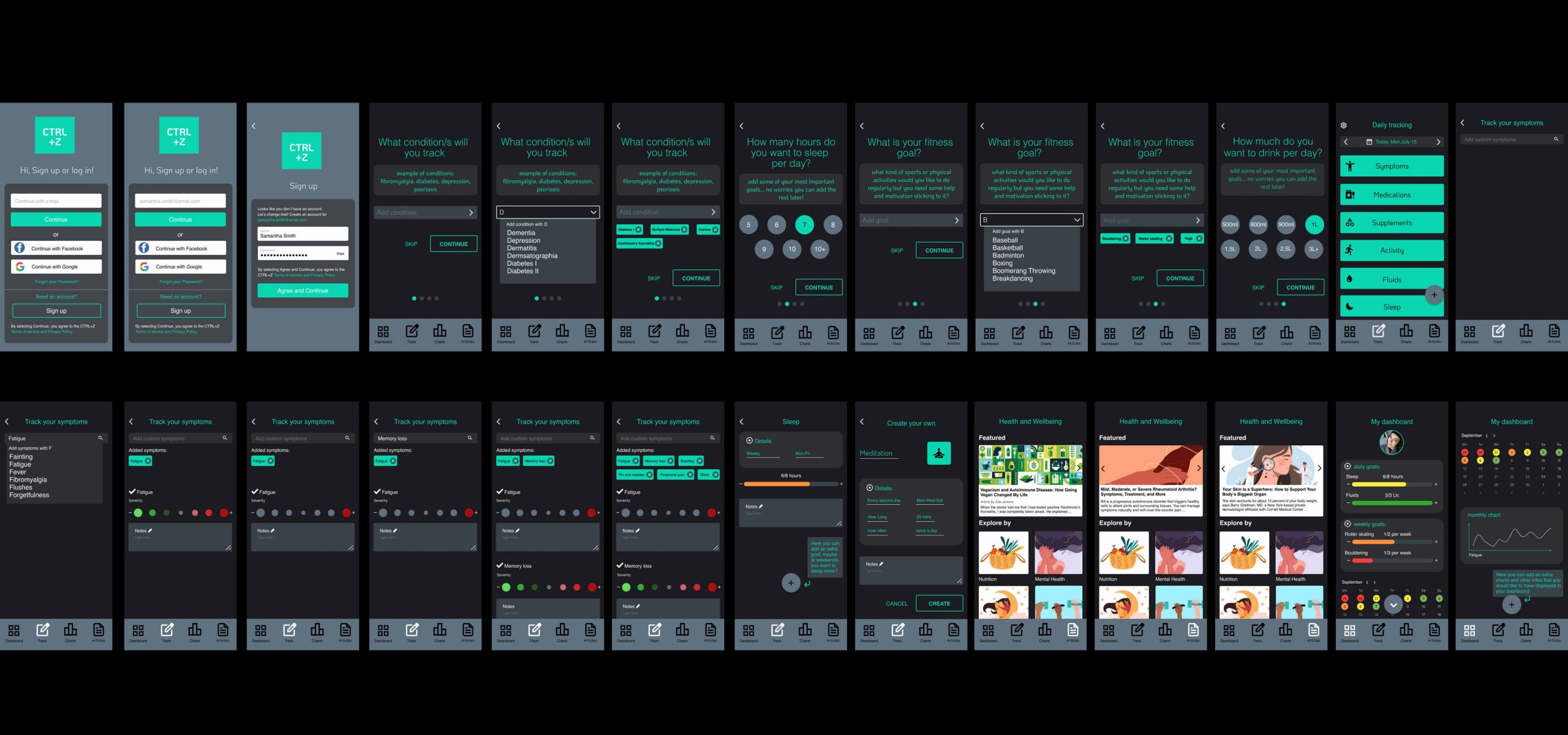
The app provides a specific section with all health and well-being tips and information for people suffering from chronic conditions. The information helps individuals integrate important dietary and lifestyle changes that are targeted to their own chronic condition.
CTRL+Z app walk-through video.


My role in this project is as a Solo UX Designer. The design thinking process adopted for this project is Inspiration – Conceptualization – Iteration. The tools I have used are Figma, InDesign, and Usability Hub.

Throughout the design process the Double Diamond Strategy was used. Here I used it for the two first steps: Discover and Define.

The competitive analysis helped me identify the SWOT and create an extensive BRD where the business goals, customer needs, and stakeholder concerns all come together. This document is crucial for aligning company stakeholders.


Using the quantitative and qualitative data from my survey and interview results, I defined two User Personas to better empathise with my target customers and prioritise goals according to their needs. Then, I created a user journey map to track what a user does, thinks, and feels when they encounter different touchpoints in their journey.


Based on research, I created two personas: Melissa, diagnosed with an autoimmune illness, prioritizing sleep; and Friedrich, managing an eating disorder, tracking calories and regularity. In refining the app, I decided to focus solely on chronic illnesses, omitting calorie counting for mental health.


Low Fidelity Wireframes sketches.


High Fidelity Wireframes sketches.

Making improvements and refinements to the Wireframes.


Creating prototypes was great fun!

Background:
Ctrl+Z is an app designed to help people track their chronic illness symptoms and improve/reverse their condition naturally through activities such as sports, meditation, high supplements dosage, and nutrition. Ctrl+Z offers options to download and share reports and visual infographics of overall health and documented symptoms with a doctor. The goal page is designed to motivate users, ensuring they stay on track and prioritise their health at all times.
Goals:
The goal of this study is to test the navigation and flow of the application with users. The test aims to provide valuable insights into how users navigate the Ctrl+Z app and demonstrate their understanding of the application’s key features. These observations and dialogues should identify any friction points and areas for improvement.

Test Objectives:
1. Observe user on-boarding and feature navigation.
2. Observe how easily users can track symptoms.
3. Determine the successful use of the meditation feature by users.
4. Evaluate how intuitively and easily users can use and manage their goal page.
Methodology:
This study will combine moderated, in-person, and moderated remote usability tests. The sessions will include a brief introduction, task performance with the Ctrl+Z application, and a brief discussion/survey at the end.


For the UI of Ctrl+Z, I have strategically chosen colours and typefaces. The secondary colour, #0AD6B1 turquoise, is a hue known for recharging energy, healing emotions, and providing balance. This colour is ideal for an app focused on reversing chronic illnesses and subconsciously supporting users in their everyday struggles with illness.

The use of neutral colours, along with turquoise, aims to create a comfortable and visually pleasing app experience for users. The chosen typefaces are Koho, reminiscent of computers and electronics, and Helvetica, a simple and sleek typeface that is highly legible and pleasant to the eye.

The Koho typeface has been employed to create the logo, representing the Window key shortcut/command to “go back/reset” the previous action. The name has been strategically chosen to assist people with chronic conditions in resetting/reversing their illness and going back to living symptom-free or overcoming a flare.

The Koho typeface has been employed to create the logo, representing the Window key shortcut/command to “go back/reset” the previous action. The name has been strategically chosen to assist people with chronic conditions in resetting/reversing their illness and going back to living symptom-free or overcoming a flare.
UI PROCESS – BEFORE

AFTER

UI PROCESS – BEFORE

AFTER

Preferences tests – Usability testing


Finished first UI draft!

UI first draft prototype – gallery view click here!
TL;DR – CTRL+Z Process walk-through video – a summary of the project ;)